THE CLIENT
Sullivan Tire and Auto Services is one of the leading auto care retailers in New England.
THE BRIEF
Sullivan's site had not been update in nearly a decade and their existing site failed to promote their highest margin offering, auto services. In order to stay competitive with competing retailers such as Firestone, JiffyLube and TireRack, Sullivan Tire needed a site that would not only look and feel great, but that would also increase the awareness around Sullivan's auto services and offer smooth functionality for things like buying tires and booking service appointments.
Conduct a website review and develop information architecture recommendations.
Develop the story further, build a new site for the brand and test it.
SOLUTION
Map out the primary personas' user journeys.
Build wireframes for the website that let the user know Sullivan is here for all their tire and auto service needs.
Design an experience that prioritizes gaining and retaining the user's trust
UX DESIGN TECHNIQUES
Content assessment | Affinity mapping | IA | Design studio | User journey map | Component workshop | Axure wireframes | Prototyping | Content workshops
TOOLS
Screaming Frog | Excel | Google Analytics | Pen & Paper | Post-it-notes | Axure
TEAM
I was the UX designer on a team that consisted of a creative director, strategist, UX designer, visual designer, media analyst and account executive.
DURATION
3 month project.
Deliverables
Content Assessment
KPIs
Personas and user journeys
Sitemap
DESIGN PROCESS
My design process shown below aligns with the approach our team took on this project. I was involved with everything up through the Develop stage, at which point I left the company and transitioned the project to a peer.
Discover
STAKEHOLDER INTERVIEWS | COMPETITIVE ANALYSIS | CONTENT ASSESSMENT
APPROACH
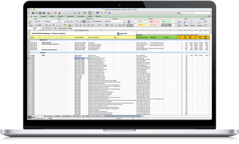
To kick the project off, the team strategist, media analyst and I began researching direct and indirect competitors in the tire and auto service space (Firestone, JiffyLube, TireRack, PepBoys, VA Tires, and more). We also interviewed key stakeholders and ran a content assessment of Sullivan's current site. After running the content assessment, conducting an in-depth competitive analysis and unpacking the insights from our stakeholder interviews, we were able to extrapolate from our findings insights that would define our strategy and highlight opportunities for the new site design.
FINDINGS
The new site would need to be easy to use, educate users about the auto services Sullivan offered, and, most importantly, build a feeling of trust. Our findings revealed that most people buying tires are making a grudge purchase. Additionally, while price was often the primary reason a user would select one retailer over another, how much a person felt like they could trust the retailer was a vey close second. Sullivan's current customer base expressed deep loyalty to them for this very reason and so it was clear that this was an important message to convey throughout the user's experience with Sullivan Tire (both online and off).
DEFINE
EXPERIENCE GOALS | KPIs | PERSONAS | SITE STRUCTURE | TEMPLATE IDENTIFICATION
KPIS & Experience GOals
Based on our discovery stage findings, we established our strategic goals and identified some key objectives we would use to measure the success of our meeting those goals.
Experience goals: Inviting tone; Trustworthy differentiator; Get in touch
Primary KPI: Increase Auto service and tire appointments
Personas
Developed high level journeys for 2 primary personas and 3 secondary personas to help direct the story and vision of the site redesign.
Primary Persona: The Advocate
Primary Persona: The Researcher
Secondary Personas:Explorer;Job Seeker;Fleet Manager
Site map, Templates and wire flows
Based on the insights and guiding principles that emerged from our research, I defined a new information architecture for the the site. Once the site map laid out all the content we would need to account for, I defined the site's templates. Page templates are pre-designed webpages that a CMS editor utilizes to publish site content and are useful for illustrating page objectives, high level requirements, and the ways that content is structured on pages. Finally, we took the templates and began to visually represent some of the key flows that would occur on the site.
Sitemap
Templates
Wireflows
DESIGN
AXURE WIREFRAMES | PROTOTYPING
Wireframes and prototyping
With a solid game plan in place after the discover and define stages of the project, I began to design the wireframes. Starting with the navigation, we had a lot of information to keep readily available to the user so it was a great challenge thinking through how to best position the most important pieces of information.
Another part of the site was an awesome challenge to think through was the make an appointment flow. As Sullivan's primary business goal was to leverage the site to increase the number of auto service appointments made online, we landed on the primary call to action on the site being a call to make an appointment. From here a user could enter the flow for setting up an appointment for anything from tire installation to an oil change. A similar challenge lay here in figuring out how to minimize form friction with our users while still capturing a good deal of required information.
A final great challenge laid in creating a smooth flow for the user as they search for and committed to purchase tires.


