THE CLIENT
Rescue by LogMeIn is an industry-leading remote support software.
THE BRIEF
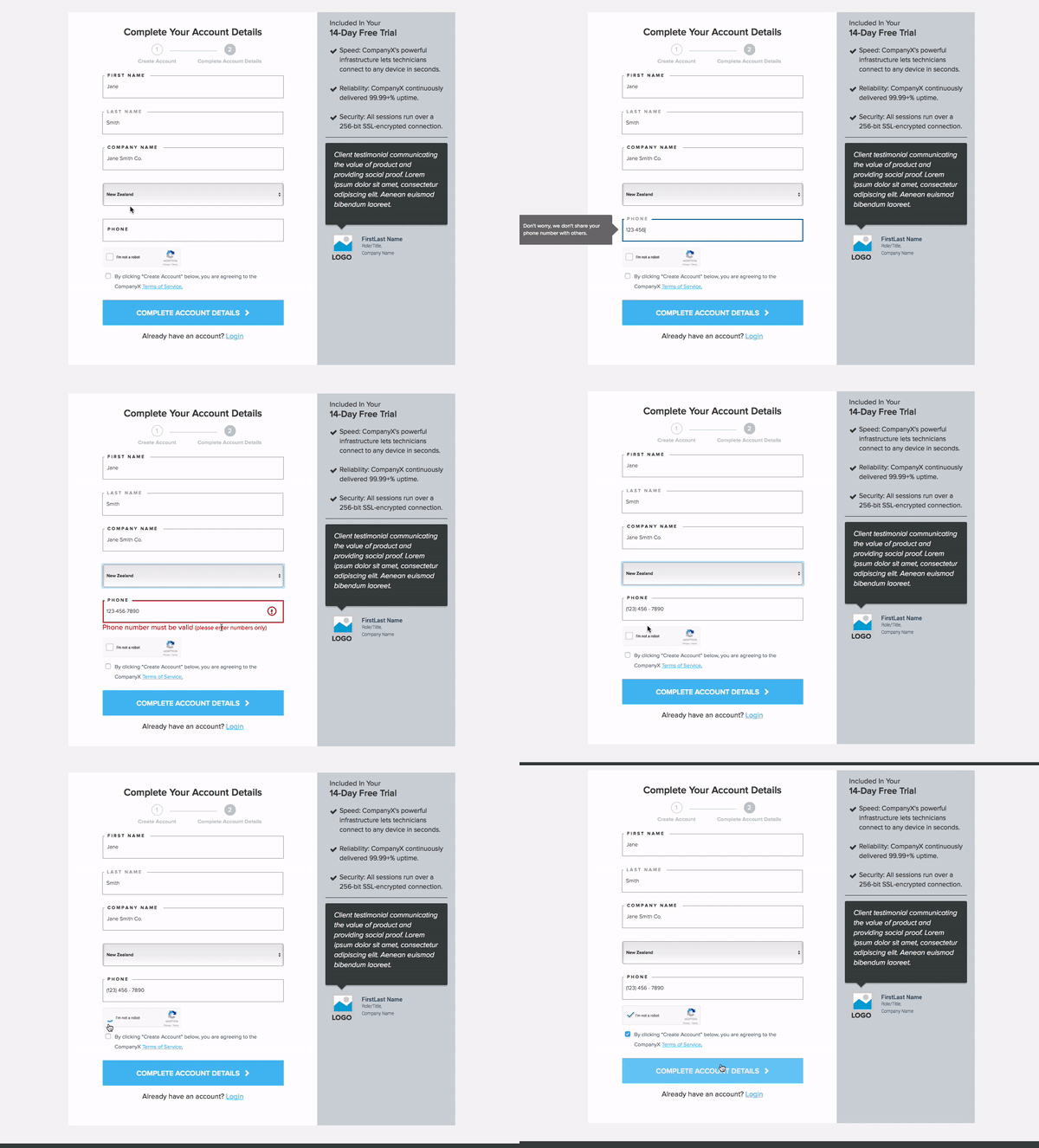
To increase conversation rates around their free trial registration, Rescue needed a full flow redesign.
SOLUTION
Run a heuristic evaluation and compile a best practices guide
Wireframe a registration flow prototype - the devil is truly in the details with forms - striving to hit that perfect balance between useful for the business and easy for the user, so much of the success of this design hinged on designing an optimal UI
Test and iterate
UX DESIGN TECHNIQUES
Heuristic analysis | Competitive Analysis | Sketching | Axure wireframes | Prototyping | User Testing | UI design
TOOLS
Pen & Paper | Axure | UserTesting.com
TEAM
Creative director, strategist, UX designer, visual designer, account executive and project manager. I was the UX designer.
DURATION
1 week project.
Deliverables
Wireframes - High fidelity clickable prototype
POst-PRoject Learnings:
Published an article compiling summary of research re: form best practices.
For more, read on or view post here: https://www.wearegenuine.com/blog/craft-effective-forms/
These days, just about every site needs great forms. Forms generate leads, create support tickets, collect user feedback and are even a source of potential new product innovation from your customer base. The big problem is that forms can be confusing and frustrating for your users. When that happens, the users either stop, give you weak data, or worse, just plug in fake data.
Why does this matter? Simply put, great UX design on your form will show up on your bottom line. If you want more leads, better feedback and revenue growth, here are some UX-design best-practices that really work (we know because we test everything that we can!)
1. Implement in-line validation:
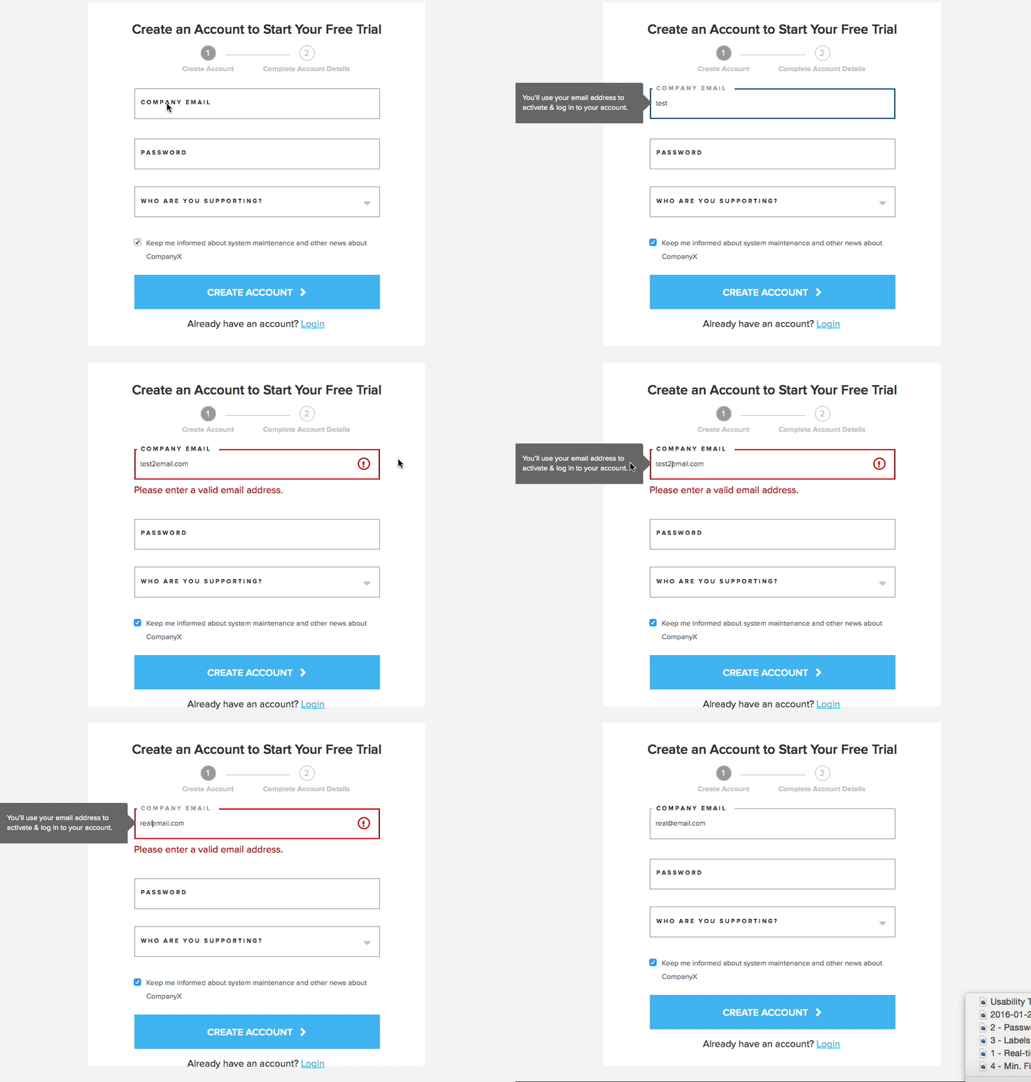
Help prevent errors and make error messages easy to understand with real-time error reporting/in-line validation.
We recommend using clear colors for system-status messaging, red for errors and green for valid entries.
2. Include hints, examples, or model answers to demonstrate the expected input:
Add hint labels that let users how their information will be used. For example, let users know that their email address will be used to activate and log in to their account. This will help minimize user frustration later in the process and improve the quality of lead by dissuading the use of false email addresses.
3. Implement real-time feedback on password fields showing requirements and strength, and let user SHOW/HIDE their password:
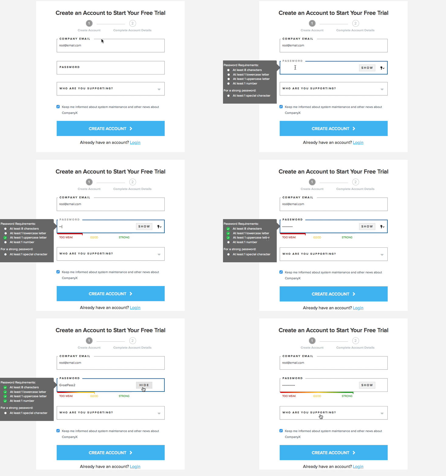
Use only one form field for a password and include a SHOW/HIDE toggle to allow users to confirm that their password was entered correctly. This removes the need to have two form fields for password verification.
Clearly illustrate any password requirements.
Visually demonstrate the strength of the user’s password with a visual meter.
Use real-time feedback to let the user know if the password is acceptable.
4. Keep in-line labels visible at all times:
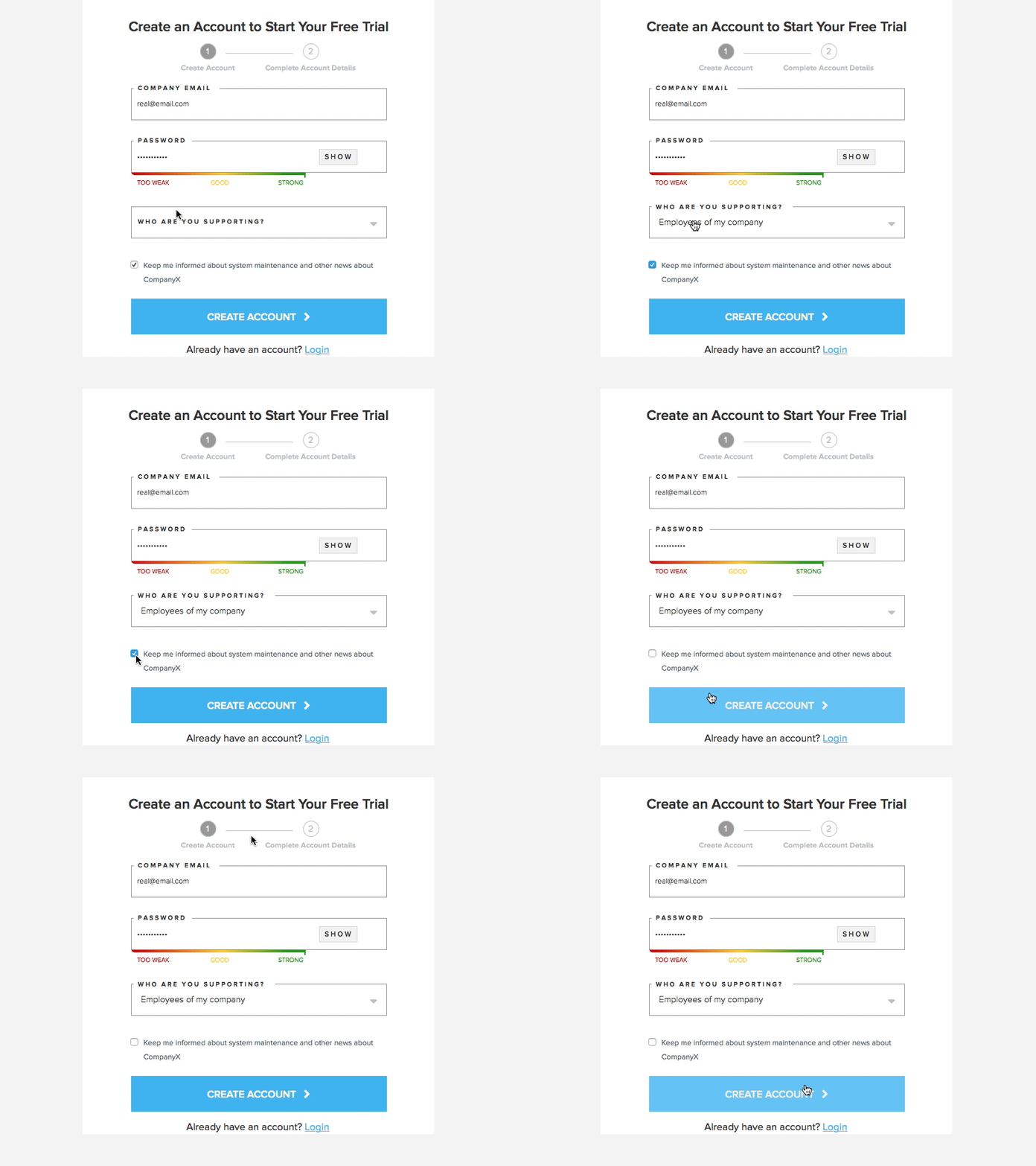
Keep field-labels visible at all times, so users can confirm that they entered correct information after adding text. The label should never act as a placeholder that disappears once the user has clicked into the field to input their own information.
5. Minimize form fields:
Fewer form fields means less friction for users and more conversions for businesses. BUT most businesses have the goal of quantity AND quality leads or conversions. More form fields can mean better quality leads, so we recommend that businesses always test for ideal form length.
When you have to include more fields than is ideal for the user, there are still ways to make it palatable. (see next tip)
6. When there are multiple steps in a task, display all the steps that need to be completed and provide feedback on the user’s current position in the workflow:
If your form requires more than five form fields, break them into a minimal number of steps.
Indicate progress to users as they register/sign up and use visual cues to let them know where they are in the process.
7. Provide context of the value users are receiving in exchange for filling out a form:
If the user is signing up for a free trial or service, give context and reaffirm WHY they should give you their information.
if it’s a free trial, reinforce with a clear headline and serve up details regarding what is involved in the free trial. This reaffirms for users that they are getting what they expected and what they were willing to sign up for when brought to the form.
8. Provide formatting hints wherever possible:
Credit Card: xxxx xxxx xxxx xxxx; or tell user to enter number with no spaces
Phone: (xxx) xxx-xxxx; or let user know to enter number with no spaces
9. BE CLEAR ABOUT HOW A USER’S INFORMATION WILL BE USED:
Pretty sure we all get this feeling when a form asks for our phone number. But thank god for seat belts—metaphorically speaking. Keep users driving through the form by letting them know that their personal information will not be sold to telemarketers or used for other nefarious purposes.
10. CAPTCHAS – JUST DON’T USE IT:
CAPTCHAs put the onus on users for spam issues a company may face. But if a company insists on the requirement, see if they are willing to implement a behind-the-scene solution like the “Honeypot” or a timing technique to identify if a real person filled out the form.
At the very worst, use something like Google’s “I am not a robot” user-facing recaptcha. It has a fun tone and is a simple check-box (most of the time).
Final thoughts
While best-practices help inform our thinking on a design, there’s really nothing that can replace your personal understanding of users and the system they will be interacting with—or the magic of user testing.

